
- Products
 Saakuru Blockchain
Blockchain with no gas fee
Learn more
Saakuru App
All-In-One crypto wallet
Learn more
Saakuru SDK
Embed Web3 wallet easily
More Info
dApp Store
Discover Thousands of dApps
Learn more
Saakuru Games
Guild Management Tool
Apply for scholarship
TomoOne
Grow virtual pet
Learn more
Saakuru Cashback
Shop online with discount
Learn more
Saakuru Blockchain
Blockchain with no gas fee
Learn more
Saakuru App
All-In-One crypto wallet
Learn more
Saakuru SDK
Embed Web3 wallet easily
More Info
dApp Store
Discover Thousands of dApps
Learn more
Saakuru Games
Guild Management Tool
Apply for scholarship
TomoOne
Grow virtual pet
Learn more
Saakuru Cashback
Shop online with discount
Learn more
- Token
- Academy
- Saakuru Live
- About us
- Community


Products
Saakuru Blockchain
Blockchain with no gas fee
Saakuru App
All-In-One crypto wallet
Saakuru SDK
Embed Web3 wallet easily
dApp Store
Discover Thousands of dApps
Saakuru Games
Guild Management Tool
TomoOne
Grow virtual pet
Saakuru Cashback
Shop online with discount
 Saakuru Blockchain
Blockchain with no gas fee
Saakuru Blockchain
Blockchain with no gas fee
Learn more
 Saakuru App
All-In-One crypto wallet
Saakuru App
All-In-One crypto wallet
Learn more
More Info
Learn more
Apply for scholarship
 TomoOne
Grow virtual pet
TomoOne
Grow virtual pet
Learn more
Learn more

5 crypto price chart patterns you should know
No one can be certain whether the value of a cryptocurrency is going to rise or fall, however, we can make educated guesses about market trends that will help us make more sensible decisions about what we do with our money and investments. One way to do that is by recognizing and understanding patterns on cryptocurrency price charts.
You’re likely already aware of how price charts work, but did you know that they can be a lot more than just a seemingly random collection of colorful rectangles? By viewing the fluctuations in a cryptocurrency’s price over a sustained period of time, it is possible to recognize how its price could change going forward based on historical trading behavior.
In this AAG Academy guide, we’ll explain what price chart patterns are, and look at five of the most common.
What is a crypto price chart pattern?
A cryptocurrency price chart may look like a confusing heap of lines are rectangles, but in the same way that you can pick out constellations in the sky if you know what you’re looking for, it is possible to identify price chart patterns. This is a handy trick to have if you’re a trader, since recognizing price chart patterns can help you make better decisions with your investments.
A price chart pattern is made up of a series of trend indicators that, when combined, show a familiar shape or form that can help us determine how prices are likely to change in the coming days or weeks. These patterns are based on historical movements, rather than arbitrary designs, so taking notice of them is usually a sensible idea.
Patterns not only help us identify trends in the market, which could lead to profitable trades, but they can also help us avoid potential losses.
How do crypto price chart patterns work?
To understand cryptocurrency price chart patterns, we first need to understand the chart itself. Price charts are commonly made up of what the industry refers to as “candlesticks,” which are rectangular identifiers that show how the price of an asset has moved during a certain period of time, such as one minute, ten minutes, 30 minutes, or longer. You can adjust this time period yourself, depending on the view you prefer, with most price charts.
Candlesticks are usually red and green or black and white. Red and black candlesticks indicate a decrease in price, while green and white candlesticks indicate an increase in price. The bigger or longer the candlestick, the greater the movement. “Wicks” at the top and bottom of the candlestick show the highest and lowest prices during that time period.
We have a complete AAG Academy guide on candlesticks for those who want to learn more about them, but for now, let’s move onto patterns. When a collection of candlesticks is displayed together, certain shapes or patterns can appear — like constellations in the sky — that signify bullish or bearish trends that traders should be aware of.
A bullish trend may indicate that it’s a good time to buy a particular asset in anticipation of its price climbing even higher. A bearish trend may signify that it is a good time to avoid or hold a particular asset until its value starts to climb again. To give you a better understanding of bullish and bearish patterns, let’s look at some of the most common in more detail.
What are 5 different types of price chart patterns?
Here are five of the most common price chart patterns that every trader and investor should be aware of:
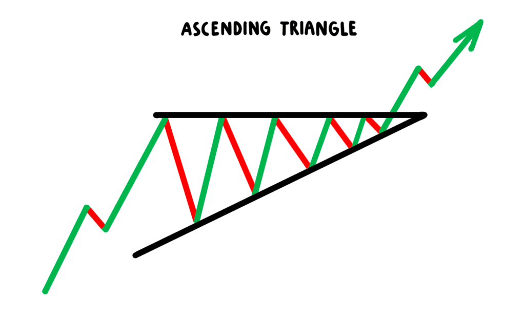
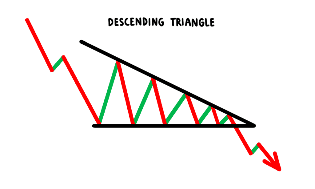
Ascending and descending triangle
Ascending and descending triangles are some of the most common patterns we can identify on crypto price charts. They appear when an asset has seen a period of higher lows (ascending triangle) or lower highs (descending triangle).
When we see an ascending triangle, it suggests that the value of an asset is gradually beginning to rise, since its price is no longer falling to the same lows it has recently experienced.
When we see a descending triangle, it suggests the value of an asset is gradually going to fall, since its price is no longer hitting the highs it was previously hitting.
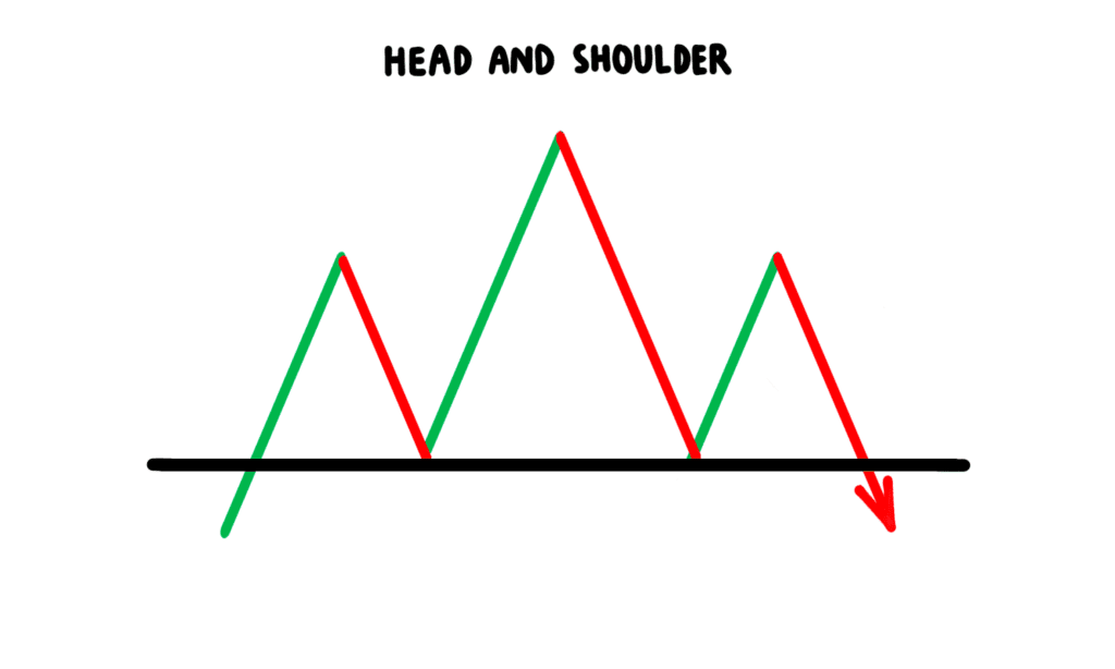
Head and shoulders
A head and shoulders pattern is easy to recognize, but not exactly the most helpful pattern. That’s because it is made up of a series of three bullish and bearish peaks and troughs (temporary highs and lows), with the second slightly bigger than the first and last. When viewed together, it looks a little like two pointy shoulders with a pointy head in between.
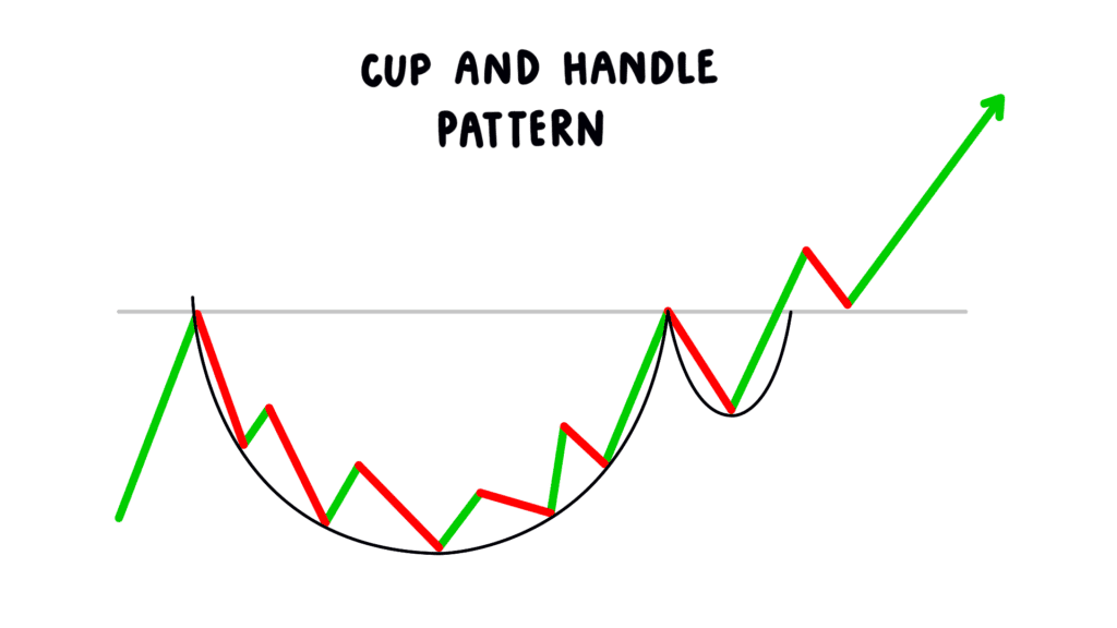
Cup and handle
A cup and handle pattern appears when an asset has seen a sustained period of smaller highs and lows, which look like the bottom of a cup, followed by a period of more significant highs that turn into a wedge pattern (more on this below), that looks a little like a cup’s handle.
This is seen as a bullish reversal pattern, since for a sustained period of time, an asset’s price has risen, but then it experiences another period of declines.
Triple and double top and bottom
A triple or double top and bottom pattern appears when an asset’s price bounces off the same high and low two or three times. This can look a little like a head and shoulders pattern, except it does not have the more significant peak and trough in between two smaller ones.
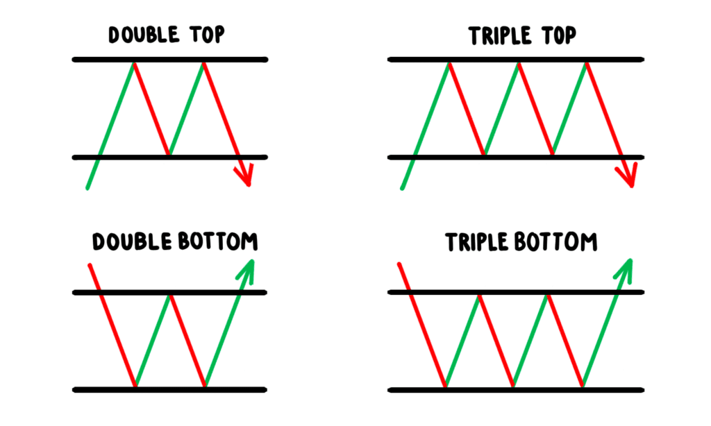
A triple or double top and bottom suggests market sentiment around an asset is shifting and that prices are about to change direction, with the market unable to make up its mind about whether or not it is bullish or bearish for a period of time.
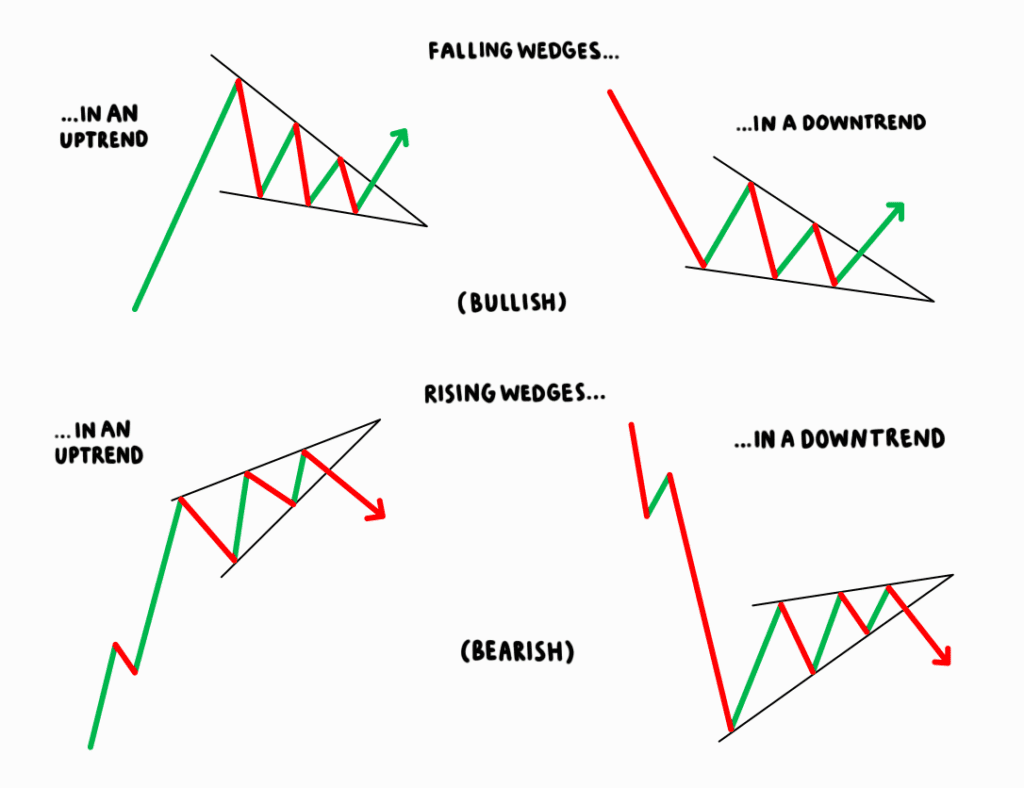
Wedges
Wedges, which also appear in the cup and handle pattern, can have two functions. They may be bullish and bearish reversals that occur when trend lines start to converge.
A rising wedge shape suggests a bearish signal, while a falling wedge shape suggests a bullish signal. A falling wedge with a slope that goes against the prevailing uptrend, which is still regarded as bullish, indicates a continuation pattern.
How to trade using crypto price chart patterns
These price chart patterns can tell us a lot about how a cryptocurrency’s value has changed over a period of time. More importantly, they can also indicate how it may change over the coming hours, days, and weeks. If you’re hoping to make money by trading cryptocurrency, understanding these patterns and recognizing how trends change can be incredibly valuable.
If, for instance, you recognize that a rising wedge pattern is beginning to appear on a price chart, you may choose to sell your asset before the converging lines get too close and prices suffer a sustained period of decline. If you see that a falling wedge is beginning to appear, it may be a good time to buy or hold that asset ahead of a sustained period of price increases.
Of course, this all depends on how you like to trade and your personal strategy. The most important thing is recognizing these patterns and then making sensible decisions about how to manage your own assets and your money. It is also critical to bear in mind that none of these patterns are guaranteed; in other words, a price increase or decrease is never certain.
References
- Crypto chart patterns explained
- Chart patterns every crypto trader should know
- How to trade triangle chart pattern
- Support and resistance basics
Frequently Asked Questions
Price chart patterns can help traders determine whether a cryptocurrency’s value is going to rise or fall. They can use this information to make more sensible decisions about their money and their assets — and perhaps avoid a potential loss.
Bull market patterns signify that the price of an asset is going to rise for a sustained period of time. Bear market patterns signify the opposite of that — that an asset’s value is likely to fall for a sustained period of time.
Support levels are an area on a price chart that show traders’ willingness to buy a particular asset. When a support level is reached, it suggests that demand is greater than supply, and therefore any recent price declines are likely to halt and reverse. Resistance levels are the opposite of that; they indicate when supply will exceed demand and prices will fall.
A moving average (MA) helps level the price data of a particular asset over a certain time period by creating an average price. MAs are calculated to help determine an asset’s support and resistance levels based on past prices.
Was this article helpful?
YesNo
About the author
Disclaimer
This article is intended to provide generalized information designed to educate a broad segment of the public; it does not give personalized investment, legal, or other business and professional advice. Before taking any action, you should always consult with your own financial, legal, tax, investment, or other professional for advice on matters that affect you and/or your business.


Get news first
Be the first to get our newsletter full of company, product updates as well as market news.
🍪
We use cookies to make your experience better. Learn more: Privacy Policy
Accept